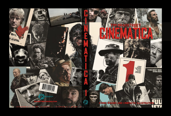


 Tim Bradstreet‘s illustration work has developed a strong fan-following for a reason, whether it’s his iconic illustrations for VAMPIRE: The Masquerade, his comic book covers for Marvel’s THE PUNISHER or DC/Vertigo’s HELLBLAZER, or even his movie poster campaigns and advertising work… he has been an inspiration to many, and a constant visionary that develops masterful ideas that transcend generational interests. His newest work is a personal and passionate project that fans of film and popular culture will likely adore. CINEMATICA is a collection of intricately detailed art depicting some of the most iconic figures in cinematic history, and the scope isn’t limited to any one genre. I’ve known Tim for decades now, have watched him create in person, and even had the honor of serving as a model for him a few times. As CINEMATICA is nearing a proper release, I wanted to sit down with him to find out how he found inspiration for this particular project, and how his approach to this was unique and layered beyond almost anything he’s ever done. We’ll be spotlighting CINEMATICA beyond this interview, but this should serve as an idea of what you can expect. Read and enjoy, I cannot wait for you to see what I’ve seen.

You can pre-order CINEMATICA right now using this link
Mark: Howdy Tim, knowing how excited you are about this new project, I’m thrilled to be able to help introduce it to the masses. Let’s jump right in with the most obvious beginning, and let the readers know how you found inspiration here, perhaps going back to the earliest days. This really is a massive project that is both beautiful and haunting, but most importantly reminds us of the connection between artwork and cinema, something I know means a great deal to you.
Tim: You mention haunting, and oddly that lands with me because I really was haunted to a degree by the compulsion to pursue the subject matter. It seems like I’ve had this magnetic pull towards film or TV characters my whole life. Between 5 and 10 years old it was mostly cartoons that tugged at me to draw my favorite characters. At some point between 5 and 7, I was fascinated by Star Trek and Jonny Quest. It was genre stuff mostly, Science Fiction, Fantasy, Horror, Adventure, and the action that goes with that territory. etc. As far back as I can remember it’s been the stuff that I absorbed from TV or movies that struck a chord with me. I drew Dinosaurs, Cars, creatures, stick man wars, flying saucers, spaceships, you name it, and all of it was inspired in some way by the entertainment I was exposed to. I was 10 when Star Wars came out in ’77. It was the TV trailer that made me crazy to see the film, but the real treasure trove was the toys, posters, cards, the soundtrack, comics, and novelizations, etc. – Star Wars was everywhere, and I’m an absolute sucker for packaging, whether it be a book, video, or soundtrack cover. I’m one of those people that’ll buy something sight unseen just for the cover it’s wrapped in. I’ve always wanted to be the guy who created that type of art. Art that compels others to pick it up and check it out.
I’ve always had an empowering emotional connection with a story’s protagonist. If I can strongly identify with a character, it’s very easy for me to put myself in their shoes. The connection is vicarious. That expression comes pouring out as my pencil hits the paper. I feel all of those emotions as I’m working. I don’t remember a time when I didn’t have a pencil in my hand, drawing whatever interested me. I feel like I’ve been drawing film and TV subjects from the beginning. As I got older I had much more exposure to the cinema. I was drawing stuff like Mad Max, Rambo, Snake Plissken,etc. My old sketch pads and school work are covered with such examples. After High School I got lucky and went to work freelancing, doing illustrations for role playing games. That included a lot of Sci-Fi, horror, adventure, and the like. After breaking into comics and having settled into working as a cover artist I began to be offered work on licensed film and TV projects, like Dark Horse’s Star Wars, Alien, Xena, and Lost In Space. I got to do The Shadow, from the Russell Mulcahy film, covers for the De Niro era Frankenstein movie adaptation for Topps. and covers for The Crow: City of Angels, from Kitchen Sink. I was able to pick up work because of my photo based style. The art was realistic, but I had one foot heavily entrenched in the stylization and craft of black and white line art. Not photos, but photo-real, like you see with art-based film marketing. Though film marketing art is more of a painter’s playground. Not a lot of line art illustrators, but they do exist. The great Jack Davis is one that leaps to mind. William Stout is another, but both of those guys draw AND paint. I’m more of an illustrator who can color.
Mark: I know from previous conversations we’ve had, you were like me in that we both used to immerse ourselves in those classic moviemaking magazines like Starlog, Fangoria, Cinefex and others. Did those play a role in your fascination with cinema, or was there other media that made an impression? When exactly did your relationship with art and film really pick up steam?
Tim: Honestly, I think the steam was there from the very beginning. I was 13 years old in 1980, and I absolutely devoured whatever sci-fi or horror magazines I happened to get my hands on. I’d scour the supermarket shelves, I searched used book stores, antique stores, garage sales, anywhere I might track down back issues of Creepy, Eerie, Famous Monsters of Filmland. I’d split from my parents when we’d hit the local mall and head straight to the Book Bazaar, looking at all the sci-fi paperback covers and pawing through Frazetta art books for hours. Magazines like Starlog used to rivet my attention. A magazine specifically focusing on Science Fiction! I was a voracious reader. 1979 brought Fangoria, but I didn’t make that discovery until issue #7 from 1980, featuring an article on Tom Savini and his work on Maniac. If my mom was going grocery shopping I’d always take the trip with her so I could peel off and go straight to the magazine section. The longer she took to shop, the better. I was just fine assaulting the comic racks and sifting through the magazine titles, always on the lookout for the next treasure. Those magazines were great resources for articles and photos, stuff you really couldn’t see anywhere else. I didn’t have much money at that age, but I generally had enough in my pocket to buy a couple of 50-cent comic books or a copy of the most recent Starlog. At about the same point in time I saw my first copy of Heavy Metal. The European style seemed like it was from another planet. Discovering Moebius in the pages of Heavy Metal was like a 500 megaton explosion going off in my brain. My parents wouldn’t let me buy it, but for at least a month or two there was a copy of Walt Simonson’s Alien film adaptation on that supermarket magazine rack. Simonson was an artist I knew very well from American comics. His work on Alien made me realize that if I followed my dream of making it in comics, that could easily lead to movie related projects. Al Williamson and Carlos Garzon’s work on the illustrated adaptations of Empire Strikes Back, and Blade Runner were pivotal works for me. I also sporadically collected mags like Cinefex and Cinefantastique. Sporadically because those books weren’t always available.All of that stuff made a huge impression. So I feel like I’ve always had this relationship with movies and art. Movies or music are always in the background when I work. Even when I’d be illustrating a cover for Hellblazer or The Punisher, I see it as a movie. Art and movies are synonymous in Street-World. One feeds the other and vice versa.
Mark: So with CINEMATICA now coming into being, when exactly was this full concept born? It’s obviously the product of many years of love and passion for cinema, but at what point did you hit the “I’ve got to get this out there” stage? What made you switch things up from working almost exclusively in comics to working more on film? Did you have a plan for what it was becoming, and did you know the medium you wanted to work in, or were you open to more than just pen and ink?
Tim: Taking this detour into film art was not something I planned. It happened out of necessity. I’d recently come off doing covers for IDW’s Star Trek – The new cast (as of 2009) experiencing the classic adventures of the starship Enterprise. We had the rights to use the actor’s likenesses. Full disclosure, I’m a certified Trek nerd, so it was a lot of fun. Doing that stuff regularly, month by month for 25 issues got me in the habit of working with actor’s faces and I really enjoy that. That was the first time I had any inkling of an idea to begin a personal body of work based on film’s and/or film characters. I’d been playing around with some characters I liked. Compositing figures or faces so I could do my own backgrounds, or re-imagine compositions. I’ve always loved the cinematic frame, and admired directors like John Ford, Akira Kurosawa, or Stanley Kubrick, each of whom were masters at cinematic composition. I decided to use that type of presentation for whatever this project turned out to be. I came up with a specific dimension for that widescreen panel and began to play around with a purpose. I thought it would be a really cool way to do a short smaller format art book or perhaps a kind of sketchbook. My first one was a shot of Fauno and Ofelia from Pan’s Labyrinth. The second was a close up profile of Marv from Sin City. I was pleased with the illustrations and having fun. My third choice was another profile closeup of Noomi Rapace from The Girl Who Kicked The Hornet’s Nest. I designed it so that it could play alongside the Marv image on the same page. The two images balanced each other. So I also began to imagine how the images might fit together as a single or 2-page spread design. I could figure all that out later. The first thing was to compile enough images. I’d just seen HBO’s ROME and I became a huge fan of Kevin McKidd and Ray Stevenson, so the subject I decided on next was McKidd as Vorenus, leading the soldiers of the 13th legion. I began these first illustrations in a very dark style, lots of black, very high contrast. I wasn’t sure yet if I was going to stay married to that look, or decide to open it up to experimentation. There was no plan at the beginning other than the format. I had no rhyme or reason but for drawing things I was into at the time. I had several more laid out and ready to start drawing but my schedule was too full to continue at the time. Unfortunately, real life was about to intervene. A confluence of events, all of which were catastrophic to some degree. It was an extremely tough time. I went through a stretch where I couldn’t draw. Period. Not because I physically couldn’t, but because I’d had a head-on collision with depression. I just couldn’t. I didn’t draw anything for over a year. I couldn’t even look at my table. Each day I’d wake up and ask myself, “Am I ever going to want to draw again?” It was agonizing. It was terrifying. That’s about as simply as I can put it. It took around 14 months for me to feel the urge to want to pick up a pencil again. I wasn’t so sure I wanted to step immediately back into the meat grinder. I seemed to be bouncing back slowly but surely but it was peaks and valleys. One step forward, two steps . . . you know the drill. There was a pretty good gap between those first widescreen illustrations and where I eventually picked up the thread again… and the path I’d started on decided to take a massive left turn.
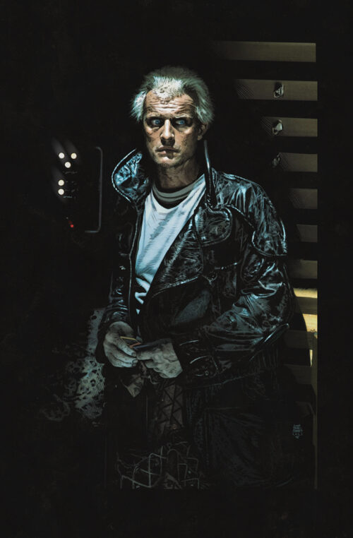
Click on image to see it full-size.
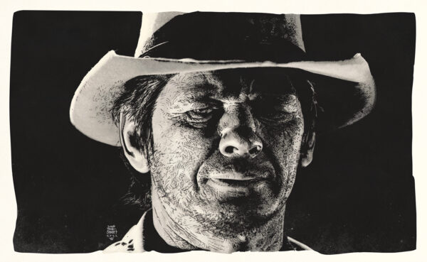
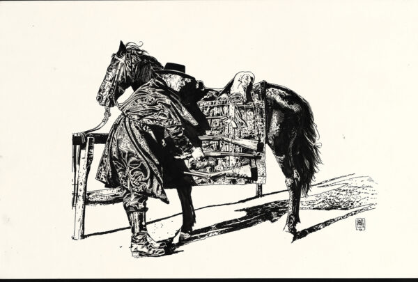
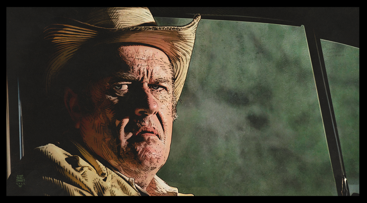
But before I could get there, I had a huge setback and found myself struggling with another block. I tried everything I could think of to break out of it. Generally, when I’m feeling like complete crud, I go to my go-to’s – My favorite movies. There are the comfort films that you could watch 100’s of times and not get sick of, and then there are the film’s I try never to ‘over-watch’. You break them out judiciously when you most need them. I was in such a state that nothing worked to lift me. All the sure-fire material was landing flat. Nothing was working. There was not an ounce or a remnant of joy in my being. It was a completely irrational state, and what made it even worse was that I was absolutely aware of that fact, and there wasn’t a damn thing I could do about it. So I went to the one thing that wouldn’t make me feel worse. TCM. I watched nothing else for something like 8 weeks. Very slowly, bit by bit, I began to feel better. A steady diet of films I was familiar with but never bothered to check out before. The lion’s share of which were made before I was even born. Nothing was over-familiar. Old, yes, but also new and fresh because for the most part, they were films I’d never seen before. I had zero worldly connection to the era when the films were made. Everything stood on the other side of my life’s experience. It didn’t happen right away, but the stress began to fall away and my creative engine began to slowly fire back up. I just awoke one morning and heard myself utter the words… “I need to draw. I need to draw Robert fucking Mitchum”. I’d amassed a huge reference library over the years and I kinda already knew the image I wanted to jump into first. It was a big portrait style headshot. That sleepy-eyed, world-weary magical mug of Mitchum’s. I’d never been all that interested in drawing the classic stars of yesteryear, but I also knew Mitchum defied such a classification. Same with Charles Bronson, those one-of-a-kind faces that seem to be carved out of stone. How had I never thought to draw him before? I dug in and penciled it in one long marathon session. I was sure I’d be horribly rusty, but I was also quite inspired and confident. I busted out my crowquill pen and inked it top to bottom the next day. Then there was that voice again, speaking loudly in my subconscious . . . “I have to draw Lee Marvin. I have to draw him right fucking now.” So I picked a shot of Marvin from The Dirty Dozen and got to work. With that one finished, I had to draw Clint next, and I already knew it was going to be The Outlaw Josey Wales. Some ideas came from left field. I was about to shut down one night, surfing film options and I landed on this fun early 70’s John Wayne western, Big Jake ,,, I knew right away that the next subject I’d be tackling would be Richard Boone. As a kid, I loved that movie, especially Boone, as the very cordial very deadly John Fain . . . This was fun! No one was directing me. There was no 6-headed film studio approval machine. Nobody was rushing me. There was no pressure to hit some distributor deadline. Prior to that Mitchum illustration, I hadn’t produced a damn thing for months, but now I couldn’t stop. So like I mentioned, not a conscious decision on my part to switch to the movie stuff. That’s just kinda how it played out, but it was still another couple years before Cinematica fully formed.
Mark: One of the things we talked about was how CINEMATICA is very much a love letter to movies, and there’s definitely some talk about craft and technique, and information normally associated with an art book, but the book really has more of a focus on the films themselves. What is the story behind that choice, was that really important for you here?
Tim: The movies themselves serving as the linchpin is very important. The choice seemed natural. You hit it right on the head. Cinematica is a love letter to the movies. None of this work was assigned by the marketing department at Lion’s Gate… Clint Eastwood did not show up at my door to see if I might want to create new artwork for a re-release of High Plains Drifter… Varese Sarabande didn’t contact me to see if I might want to do cover art for the Blade score by Mark Isham… okay, that actually did happen, but it was never published by Varese. It graces no physical vinyl re-issue. But it is published in Cinematica Volume 1. No studio hired me to do any of it. I was compelled. The films honored in this book, the actors that inhabit the characters, the hopped up cars, and one-of-a-kind helicopters . . . it’s all a lifelong obsession. Paying homage to these films is important because it’s movies that power this whole machine.
Mark: This isn’t meant to be a “gotcha” question, more of an observation. I noticed that Volume One is very male-driven in its subject matter, and I’m curious if there’s a reason there aren’t more female subjects? Are you perhaps saving that for future editions?
Tim: I’m so glad you asked that question. Starting of course when I was very young, I’ve had a very strong connection to male-driven stories and characters. I mentioned the word vicarious earlier. As a male, I’ve always identified with stories featuring strong male characters. It’s as simple as that. All my heroes were guys for the most part. Prior to the 21st century those roles rarely featured a woman as the main protagonist. They exist for sure, but until fairly recently, those roles were overwhelmingly male driven. We curated the content with no agenda other than picking movies that we all 3 agreed should be in the book, and by the quality of the art. Fortunately, the last 5-10 years has gone a long way towards changing the game. Actresses have been stepping into big hero roles that are every bit as satisfying as watching the man be the hero. I had no trouble identifying with Charlize Theron in Fury Road, and Atomic Blonde, or Katee Sackhoff in Battlestar Galactica. Those actresses lit up the screen in roles normally reserved for men. Their performances resonated with me as effectively as any male actor. That was something I’m not sure if I was expecting. Angela Bassett, Scarlett Johansson, Helen Mirren, Michele Yeoh, Noomi Rapace, Mary Elizabeth Winstead, Robin Wright, Linda Hamilton, Gina Carano, Gal Gadot, Judi Dench, Michelle Rodriguez, Viola Davis… those women kick serious ass. Just stay tuned to Cinematica moving forward. The women are going to have their say, and it’s gonna be badass.
Mark: One thing I think readers will love is that there’s a feel to CINEMATICA that goes beyond a simple collection of art. The set number of films covered provides a framework, but there are also curve balls tossed into the mix that keep it from getting too static. For example the spotlights on certain actors, and things like the trivia contest at the back of the book. I get the feeling you were out to have fun with the format, but is there more at work here? It gives me the feeling of you pushing for a hybrid of an amazing art book, and something the simultaneously challenges the reader a bit.
Click on image to see it full-size.
Tim: You are definitely on the right track. If I set out to publish Cinematica as a standard artbook, we’d be seeing a lot of the same artwork, but we’d all be missing a big chunk of the context. It would be just another collection of art. but with movie characters. I didn’t have much interest in a “Bradstreet‘s Hollywood” style approach. Why not combine my love of movies with my art? The only thing standing in my way was trying to find a publisher to partner with, and how to present all of the material in a fresh way. In my experience, when it comes to presentation, it’s the material itself that pretty much dictates the direction. It wasn’t until very late in the creation of all the artwork that I began to consider collecting all of this unseen art and actually doing something with it. Once I figured out what the vehicle was going to be I made a conscious decision to take the art farther than the type of stuff I’d done up to that point. I thought, Why not do lobby card designs and movie posters utilizing some of the completed art I had? Hell yeah, why not? Midway through my obsession, I added that marketing angle into the mix. The scope began to widen. Movies and artwork, one element serves the other. As a fan and collector, I was totally drawn to the movie magazines from the 70’s and 80’s. Those periodicals played a big part of the average genre fan’s relationship with motion pictures. At that time there was no such thing as the internet. HBO and the pay cable movie services were still somewhat unrealistic for many low to medium income households, and it wasn’t until the mid to late 80’s that Betamax, and VCRs became affordable for the average family. Prior to the home video revolution, a movie played for its allotted time at the box office and when it completed its run, that was pretty much it. The soundtrack or film score, novelizations, and a handful of dedicated movie magazines was about the closest we could get to preserving the experience. I began collecting film scores when I was 11-12 years old. I spent most of my hard-earned money on movies, books based on movies, magazines dedicated to movies, and comics. I’ve still got copies of Starlog that look like they’ve been through the digestive tract of a Neopolitan Mastiff. All my stuff from back then has been read or leafed through hundreds of times. The spotlights in Cinematica are a small tip of the hat to those magazines. I specifically added the spotlights to focus on lesser known character actors. A lot of folks will know some of those actors and actresses, but for the uninitiated, it’s an opportunity to turn them on to someone they may not have been aware of. It’s one of my favorite topics. It’s always a gas to be talking to someone, mention some obscure actor, and that person knows exactly who you’re talking about. The conversations are great. When you have one of those moments it’s like connecting with a kindred spirit.
The trivia contest is yet another way to have fun interacting with the subject matter. Movie trivia is a topic that lies at the epicenter of the conversation I’m attempting to share. It simply wouldn’t do if the test were too easy! I wanted to make it a challenge.
Mark my words! The Cinematica trivia test will be the New York Times crossword puzzle of trivia tests! Possibly a smidge more eclectic – Not for the faint of heart. It’s not an attempt to show off what a knowledgeable film fan I am. Ridiculous. It’s a test of your movie fan karate. It should be tough. It’s a test designed for movie nerds like me. If you’re a huge genre film fan, and were born in the same generation as I was, then you have an advantage over folks 10-15 years older, or 10-15 years younger. No doubt. But this is why the scoring is so generous. Low scores will be the norm, and that’s okay. No one should feel embarrassed. It’s all about the conversation you have with your friends after giving it a go. Plus, you just may learn something you didn’t already know. My wife refers to me as a “fountain of useless information” …and folks, as Auda Abu Tayi once said to T.E. Lawrence – “I am a river to my people”
Mark: There appears to be at least two styles of art working in tandem throughout the book. In addition to the “line art” based illustrations, there is a very stark graphic design approach to many of the title pages. It actually made me think of the good old days when I would take in movie poster artwork, and then look through production stills of actual scenes from the films. What was the inspiration for you to switch gears and open with graphic depictions in an otherwise straight up collection of illustration?
Tim: During the time I really struggled to work at my art table, penciling, inking, etc, I began to develop some concepts that had been knocking around my brain for a long time. Silhouettes are one of the most powerful images that exist. As far back as the beginning of my freelance career I’ve made specific use of silhouette imagery. Somewhere along the line I began playing with the idea of bringing additional depth to a silhouette by defining certain secondary shapes within its confines. Like adding the shape of someone’s glasses by using a lighter tone to define that shape. It adds another level of definition. It could be as simple as defining a star or shield on the chest of a sheriff. Choosing to define reflective surfaces like a watch, a pendant, earrings, the lenses of a pair of goggles, or a belt buckle. Shapes within shapes. I try to keep those choices relatively simple. Once you get started it’s easy to get carried away. Most especially if you’re using digital tools, which speeds the task quite a lot, The challenge is in tempering the use of those accents, too many elements and it can be a distraction. With all that in mind, I was going through my first pass of a basic layout for volume 1, trying to lock in a solid format, but also looking for ways I could enhance the design. I didn’t want something that looked like ‘layout 101’, or some other cookie cutter shortcut to creativity. Steve had come up with a cool way to present each title so it had the weight to anchor the page wherever we placed it. I wanted to do quotes because I live for movie quotes. They immediately invoke a memorable moment. Even if you’re not familiar with the movie or the line, it jump starts your imagination. I was looking at an empty page with the title set in a likely position when my brain tipped me to something I’d been fiddling around with a frame capture from that same movie. I was experimenting with the silhouette technique. So I located the file, opened it up, dragged it over to the layout and dropped it in. The page lit up. I thought, wow, that’s perfect! The silhouette image added that something extra that I’d been grasping at. The graphic technique complimented the illustration. It looked great in relation to the title treatment. It balanced the composition of the spread, and it brought a kind of ‘editorial’ element to the content. I had a big hole to fill on the next spread, and filling that space with commentary would have been the easy way out. The right hand side of the spread worked wonderfully, but I had nothing for the left. Then lightning. Bingo! I remembered I’d been playing around with a silhouette side view of a PT boat. I opened the file. It wouldn’t work for what I needed, but the idea was sound. I’m a stickler for accuracy when it comes to vehicles, weapons, etc. I needed a PBR boat, and I thought, “no problem. I’ll just build one.”. I spent the next 4-5 hours building out this specific type of boat so it would fit like a glove as a part of the film entry. Then I thought, “Wait! Holy cow, I had an open space on the Buckaroo Banzai spread. I had left it with the gap so I could move on, but now . . . “I could build Buckaroo’s JET CAR, with the oscillation overthruster! I spent the next 3-4 hours building a side view of the vehicle rocketing across the salt flats. At that point, I had a pretty good idea that I was onto something.
Mark: The graphic, silhouette-style imagery isn’t limited to the title pages. It runs the gamut from cityscapes, landscapes, iconic vehicle side views, and other symbolic iconography. For those unfamiliar with your portfolio, is this type of graphic imagery something you implemented in your comic book work, perhaps evolved in new ways for this project?
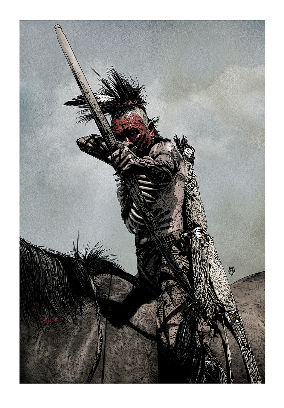
Tim: Oh, yes, absolutely. As I was saying, silhouette imagery has long been an essential element of my cover work, to my work in general. It’s a common theme over the years. Lots of black, high contrast, stark graphic images combined with detail-heavy illustrated elements. The silhouette stuff compliments the illustration wonderfully. It’s definitely evolved for this project because for the most part, I was creating that imagery in real time, as I worked on the layout and book design. It was a living breathing thing. And I hope that freshness comes across for people. The style of silhouette graphic design that I spoke of before, with varying levels of defined shapes to create depth, was a technique I’ve been playing with since the early 2000’s, but back in 2019-2020 I spent about 3-4 months working only in that style of art/design – from my chair in front of the computer. I was having a lot of trouble getting motivated and I felt like crud. I was able to snap out of it to a degree by working digitally. I was totally burnt from drawing at my table. I needed a far more productive distraction than inventing new ways ‘not’ to work, and was surprised to discover that I wasn’t having the same issue working at the computer. I was doing a figure rough of a warrior on horseback for a personal piece. I had this overwhelming urge to see if it worked as a silhouette. It was a very strong image on its own, but I recognized the potential it had for a layered silhouette image. The iteration of the warrior on the horse, with a bow, a quiver of arrows slung over the horse’s saddle, weapons, straps, various bits of tackle, and the hilt of a giant longsword jutting out of the black. He was wearing a cool medieval Moorish helmet with a chainmail Aventail. Oh, yeah. It worked. I had a folder full of cool silhouette landscapes, and it turned out that I had something perfect for the base of the image. I added that and got to work pulling out shapes. When I looked up, 4-5 hours had gone by. That stuff felt good. It was rewarding so I just kept doing it.
I created a large series of images, warriors on horseback from throughout history. Old West, medieval, The Crusades, British soldiers like you see in ZULU, with the pith helmet. Native Americans, futuristic pugilists, Civil War era, Napoleanic era, you name it. Then I switched to other subject matter and expanded the vision. I did another series utilizing a cinemascope sized landscape-style frame. I started to play around with movie characters, Michael Caine from Get Carter, Chris Reeve from Superman, all kinds of stuff. Then I got a wild hair to do a side view of Robert Neville’s light blue Mustang from The Omega Man. After that I pretty much had to build Neville’s red 1970 Ford Galaxie XL from the ground up, using only hand-selected shapes in various colors, shades, tints, and highlights. I felt as if I’d created a monster, and the monster was me! Creating those first vehicle side views was, again, something I wasn’t expecting to necessarily do anything with, but as things came together and the idea of Cinematica began to materialize it made perfect sense to add that to the mix. Plus, the work turned out to be the perfect kind of focusing activity for my obsessive/compulsive overactive brain. By the time Cinematica got into production, I’d already built some of the cars. The V8 Interceptor in the Mad Max: Fury Road spread was not created in that digital style. That one was illustrated as opposed to having been built in Photoshop. That’s probably pretty obvious if you’re paging through the book, but I make the distinction nonetheless. I couldn’t tell you how long I’ve been wanting to do some kind of art or illustration of the Spinner from Blade Runner, so attacking that subject was a foregone conclusion. Once I’d completed it, I felt like there was nothing I couldn’t tackle if it was something dear to me. I took particular delight creating a side view of the helicopter from Blue Thunder. I built that model when I was in middle school. I was crazy for that thing! I also had fun creating a lot of ancillary designs – uniform patches (Alien, Outland), specific iconography (Indiana Jones And The Last Crusade), as well as tattoo designs created for Robert DeNiro’s performance in Martin Scorsese’s remake of Cape Fear. That very productive 3-4 month burst set the table for the stuff created specifically for volume 1. Every time I turned around it seemed as if the book was evolving.
Mark: I also noticed the stylistic approach isn’t limited to a single look. There are unfinished sketches, stand alone black and white pen and ink art, black and white line art with ink washes, and fully painted line art. Some that have the authentic look of a tactile painting. Are those examples hand painted, or are you still working digitally there?
Tim: You asked me about stylistic choices earlier and I kind of avoided the question since I knew it would come up later. I don’t think I thought about color when I first began. That’s something that presented itself along the way. For me, the work itself almost always dictates the stylistic direction it takes. I don’t overthink it. I let it happen. I didn’t necessarily consider that I’d be doing anything more ambitious than pen & ink illustrations when I first began. When you set out to create a body of work there’s usually a plan, but I was flying by the seat of my pants. There’s an unfinished ink illustration in the book that’s from The Mechanic. I started out doing the Bronson part of a 2-shot. Jan Michael-Vincent is in the seat next to Bronson, but he’s more a part of the background, slightly out of focus. I jumped in and finished lining out the Bronson part. I even began laying down some heavy blacks. I think I just stopped for the night, and when I started to work the next day, I felt like a change of pace, so I just began working on something else. After completing several other images, I noted that I’d yet to finish the Mechanic piece. I set it back on my table, intending to finish it up, but I stopped myself. I was staring at it, formulating a plan of attack for the bits that remained, but the more I sat appraising it, the more I realized that I was actually pretty happy with it the way it was. I love to look at all the line art before I begin to add the heavy blacks, and sometime… sometimes, even in an unfinished state, it works. And I let it go.
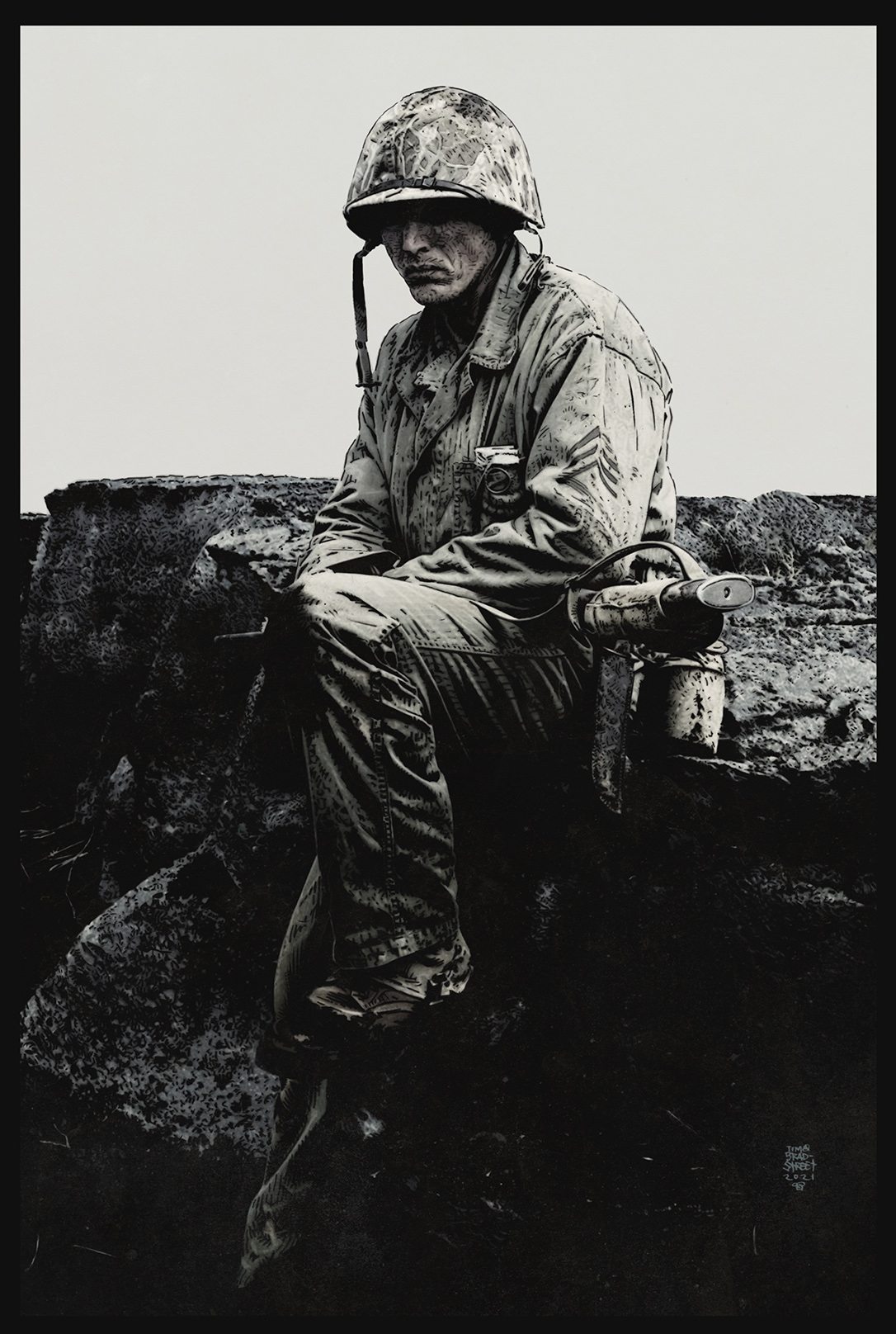
Also, I reached a point when I found myself looking at a large stack of pencils. It had to be at least 60 pencil drawings that were in line to be inked. I think I got discouraged by the mountain of work I had ahead of me. Then an idea struck me. I’d been working directly from my pencils with a lot of the freelance jobs I’d been doing. At that moment, I just wanted to save time. I thought, what the Hell. I’ll give it a shot, and if it doesn’t work, no big deal. I’ll just go back to inking. It was an experiment more than a conscious decision to change the direction of the workflow. I went into it with low expectations, but something magical happened with that first one. It turned out far, far better than I ever imagined it could. Not only that, I enjoyed the process immensely. Blacking the line art digitally gives you a tremendous amount of power to fix practically anything. You see a bad line and you want to fix it. It’s easy to get carried away, so I try my best to hold back and let imperfections be. When you’re looking at a 400dpi image at 100% in Photoshop, you could get caught in a trap attempting to clean stuff up. At 100%, every wart, every stray line screams, fix me. After I finished that first piece, I began to develop a technique for streamlining the process, and taking it further. Adding grey tones gave me the confidence to try full color. The movie illustrations are markedly more detailed, more rendered than the comics stuff. Working in this fashion was a completely different animal. I was learning on the fly and just following my nose. I’d never thought to paint or color anything when this whole thing started. After grinding through the better part of that stack of pencils, I knew that I could think more ambitiously now that color was on the table.
Like I mentioned before, the images themselves dictate how far I go. Some reach finish in an unfinished state. Some hold up wonderfully as line art with no blacks filled in. Ink washes are a joy, but at the same time it can be a very unforgiving medium. I love to use a brush for ink washes but I also really enjoy the simple exercise of painting watercolor gradients for backgrounds. Wet or dry brush textures . . . Then scan all of that stuff and utilize it when I color or tone digitally. A trick I learned from longtime colorist Grant Goleash. Working in Photoshop, those hand painted watercolors are infinitely malleable. At the heart of everything is pencil, pen, brush, and ink. I’m no painter on the level of a Dan Brereton, or someone the caliber of Jill Thompson. My tools of choice are a Crowquill, the Hunt #102 pen nib, and a jar of jet black waterproof india or sumi ink.
Mark: When you began to focus on movie-themed artwork, where was your head at? I guess what I’m hoping to get at is did you start off with a specific genre, a specific film, or just interesting faces? You certainly hit upon many of my favorites.
 Tim: Great question! I spoke above about the widescreen movie frames. Captured moments from Pan’s Labyrinth, The Girl Who Kicked The Hornet’s Nest, Marv from Sin City, etc. That was the initial spark. When I picked back up on the movie stuff, there was no guide. It was more instinct than anything. I must’ve seen a Mitchum movie around this time. I’m 99% sure it was Heaven Knows, Mr. Allison. I saw a bit of the movie once before, very long ago, and had a vague memory of it. There’s something about films made in the mid to late 50’s for me. I can’t put my finger on it, but there’s a glow to movies of that era. Mr. Roberts is another one that leaps to mind. Anyway, Mitchum just stuck in my subconscious until I felt compelled to draw him. That first drawing opened a floodgate.
Interesting faces full of character. Robert Mitchum, Lee Marvin, Charles Bronson, Harry Dean Stanton, Lee Van Cleef, Clint Eastwood, Roy Scheider, Michael Caine, Peter Cushing… a murderer’s row of my favorite heavy-hitters. Those faces are the very epicenter of Cinematica. This project allowed me to scratch an itch I’ve had for as long as I can remember, but it also went in a direction that I was not expecting. The path to discovery.
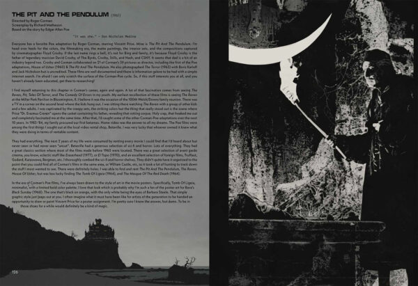
The forward momentum began with those iconic faces, but the scope had to widen. I knew pretty well that I was heading directly towards films that were more immediate to me. The iconic film experiences of my youth. I was zeroing in on the actors and movie characters that got into my brain early on. I’d work along those lines for a stretch, but it’s easy to get distracted along the way. Sometimes I’d feel like illustrating an actor like Vincent Price, but with Price, I have to keep drawing that face! The Pit And The Pendulum led to House Of Usher, which led to The Witchfinder General, which led to The Abominable Dr. Phibes. While I’m drawing him I start binging his films. By the time I finished scratching that itch, I pretty much had to take a natural left turn into horror films. I allowed myself the freedom to do whatever gave me a shred of joy. But I also had this irrational fear that if I stopped, I might not be able to get started again. I dreaded the possibility of another protracted block, so I just kept cranking out movie stuff.
Mark: Were there any other surprises along the way? Did you ever find yourself wanting to draw something from a film you’d never actually seen front to back?
I ran into all kinds of surprises, mainly because I had no specific direction in mind when I began doing this type of work in earnest. I’ve always had a deep appreciation for Boris Karloff, but I had never done a deep dive into his body of work. That face was beckoning me. A few days before the thought of drawing him began to gnaw at me, I watched a fantastic documentary specific to Karloff and his make-up man/collaborator Jack Pierce. I was absolutely on fire to illustrate the Frankenstein monster when It dawned on me that l had not seen Frankenstein, or Bride Of Frankenstein since I was like 12 years old. The monster is so iconic, most everyone is familiar with the nuts and bolts of it, but I was far removed from the film experience. I had my reference all picked out but before I sat down to work I watched both films again for the first time in 40 years. In many ways it felt as if I was experiencing them for the first time. I responded to things I was barely aware of when I’d seen them as a kid. Seeing the films again was pivotal. I was in eye-candy heaven, transfixed by James Whale’s gothic tableau. The aesthetics and the emotion was cycling through my brain as I began to draw the character. Not just lines on a page. The mood and vibe of the film felt like it was guiding my hand as I drew. That tends to happen from time to time when I’m really feeling it. I had an almost identical experience with The Old Dark House. Karloff’s makeup, wig design, the costume, the body language he employed to create his neurotic mute butler character. Just amazing. I’d seen the images before, but after seeing the film for the first time, everything about it took on a more significant meaning. Yet another example was waiting just a month or two later. I was all set to illustrate this still photograph of Charles Laughton from The Hunchback Of Notre Dame, when I realized I’d never seen the film. So I screened it before I began the Quasimodo illustration. Just as with The Old Dark House, and Frankenstein, I discovered a lushly photographed masterpiece. That to me is the untold story of putting this book together. Getting back to the root of your question, That was a bit of a surprise. I had not considered that certain of the subjects that I wanted to illustrate would push me to see films I had not seen yet. Everyone kinda knows the basic premise of The Hunchback Of Notre Dame. I’d been aware of it practically my whole life, yet somehow I’d never actually seen the film. It escaped my viewing for over 50 years. As it turned out, there were 5 films out of the first 75 that I’d yet to see.
Mark: CINEMATICA features an array of various types of images. Portraits, ‘still’ frames, basically like illustrated frame caps. Fully realized marketing style images, such as your own versions of a full blown movie poster, lobby cards, window cards, etc. Some of the content reminds me of a character commission, except the characters are from the world of film, as opposed to the world of comics. Was it your intention to explore a variety of marketing-style concepts within these pages? Did you have a concrete plan of attack, or did the content come to you randomly. The variety is one of the things that really wowed me, as going from page to page was consistently surprising in the best possible way.
Tim: That’s a nice thing to hear because that’s exactly the kind of response I’d want folks to have. When you mention “character commissions” I think you’re likely referring to those instances where I’ve isolated a figure from its original background or film frame. Sometimes a background can distract, or it could be better. As a stand alone element the material is perfectly suited for marketing purposes. I really love those ‘figure only’ illustrations because you can drop them almost anywhere within the book and they work against the white of the book paper. You can incorporate them in an infinite number of ways. They work equally as well against dark, neutral, or light backgrounds. 100% malleable. The marketing imagery really helped me to realize Cinematica as the kind of hybrid art book/magazine concept that was banging around in my head. There was no good reason to hold back. I needed to give myself the license to take the artwork in any direction that felt right. Movie marketing is something I’ve been enchanted with since I was a kid, standing slack-jawed, staring at all of the ‘coming soon’ posters and stand-ups that litter movie theater lobbies. As an artist, I’ve been blessed with the opportunity to contribute to that art form as a professional. Goodness knows I’ve been doing those types of jobs free of charge most of my life. I had a lot of practice, heheh. I’m a rabid fan of movie marketing, the one-sheets, half-sheets, three-sheets, six-sheets, inserts, lobby cards, movie stills, press kits, door panels, personality and subway posters, you name it. I love all that stuff.
Movie poster art is not really all that different from what I do with a comic or book cover. It’s essentially advertising. The goal is to visually represent the film within the confines of a single frame. Movie posters generally combine a title or logo design, and a credit block. Not at all different from the trade dress on a comic book cover. It’s no real stretch to move from one to the other. It’s all marketing to an extent. So as Cinematica began to take on a life of its own, it was inevitable that I’d begin to incorporate the knowledge and skill I’ve developed working in the film industry and apply it to the mix. As if I’d been hired by a studio to create the marketing imagery for some specific film. I just treated it like any other freelance job, except I was the client AND the talent. I imagined I had to design lobby card art for Dirty Harry. So I took one of the Harry Callahan illustrations I had already done, and imported it onto a new file with the dimensions of a lobby card. The illustration served as the overall anchor, and then I set about building some graphic design elements to combine with the imagery in question. I spent hours and hours creating a graphic that fit the environment and incorporated visual elements from the film. Once I had the art refined and everything was working compositionally, I worked up a credit block. I intentionally tailored the design to match the era of the film. As if I were doing it for real back in 1971. I also really wanted to do a poster design for a Charles Bronson movie, Breakout. My first Bronson movie in a real theater! He flies a particular type of helicopter in the film. I used to draw an adolescent’s version of the helicopter all over my notebooks. I was itching to take another crack at that thing now that I actually knew what I was doing. Killed two birds with one stone on that one. I just used 27″X40″ One-sheet poster dimensions as my template and created a movie poster by combining illustrated elements with equal parts graphic design. At the time I began doing the poster art and lobby cards, etc, I had no idea how essential to a balanced book design that would end up being. Incorporating the marketing angle really upped the ante for the whole book concept. It’s unquestionably a key component. It infused Cinematica with the fun quotient and the variety I was looking for.
Mark: You’ve turned out many hundreds of illustrations since you decided to take a detour with this body of work. All of that art is unpublished until now. Have you shown it around much or have you been keeping it a secret? I mean, I know I’VE seen some of it, but did you test the waters a bit with some of your peers in the industry? I can imagine that sort of thing can be very rewarding, but perhaps a little nerve-wracking.
 Tim: Like I was talking about earlier, I didn’t have much choice in the detour. It was either, try to embrace and enjoy this one thing that made me feel like drawing again, or not drawing at all and remaining miserable. It’s as simple as that. I didn’t show much of it to anybody for a long time. The first 2 years, I’d finish one, drop it into a folder and move on. I was enjoying what I was doing but I was also worried that if I stopped, I wouldn’t get started again. It wasn’t like a regular project at all, it was a completely different animal. At some point I brought a stack of the movie art along with me to some comic conventions. That art elicited some really great responses which were encouraging. I began to see a pattern. People were responding to the movie stuff even more than the comic work. It was apparent to me that these iconic actors, the movie characters, the movies themselves opened up a dialogue I really enjoyed. These characters were every bit as popular as The Punisher, my Vampire stuff, Hellblazer, you name it. At first it was parents with their kids. The son or daughter are flipping through my portfolio and it goes from Frank Castle to Lee Marvin from The Professionals, or The Dirty Dozen. The kid would start to flip to the next page and dad would be like, “Woah. Hold on. Was that Lee Marvin?” We’d start talking. The next page turn reveals Charles Bronson and a big head-shot portrait of Robert Mitchum. Then Mitchum again as Phillip Marlowe from Farewell My Lovely, alongside Clint Eastwood from Heartbreak Ridge. Suddenly the dad starts relating a story about how he used to watch movies with his dad. He said they butted heads on everything else, but they had this connection to movies. A shared love for Hollywood tough guys. Then the guy’s kid jumps in, and he knows these movies because his dad also shared them with him and his sister. Before that conversation was over, two or three other people joined in and now THEY were talking about their favorite movies and actors. Someone mentions The Mechanic, so I flip a couple more pages in the folio to an illustration of Bronson that was my homage to one of the movie poster designs from the film. It went on that way all afternoon. At the next show, the same kind of thing took place throughout the weekend.
Then I’d get home and tear back in. I had a fun conversation with this girl who was a big movie fan and we were comparing notes on our favorite Coen Brothers films. We were talking about Raising Arizona and the conversation turned into the both of us blurting out genius quotes from the movie, back and forth. Holly and Nick lines, John Goodman lines, William Forsyth, Trey Wilson, etc. – Then I began reciting this M. Emmet Walsh dialogue. We were cackling like idiots. Then the conversation shifts, someone else joins in and now we’re talking about our favorite M. Emmet Walsh performances. I got home a few days later and just as I was sitting down at the table to pick up where I left off, something clicked into place in my brain. M. Emmet Walsh! I had to draw M. Emmet Walsh from Blood Simple! Had to. And that’s exactly what I did. What a gas. The art I was sharing at shows spawned conversations and those conversations were beginning to influence the direction of new material… that’s just kinda cool. Aside from those shows, the art sat in my portfolio.
Over the course of years I showed various illustrations to a handful of people. 90% of them have been seen by no one else but me, and my publishing partners, Steve and Phil. The process of creating the book has taken quite a while – designing it, writing it, expanding the vision on the fly, moving 1,400 miles, polishing, and editing it. From concept to birth it’s taken 3 years. I’ve been ready to share this stuff for a long time. The art was created between 2012 and 2024. Some of the work is over a decade in the dark. Hanging out with the mushrooms. Impossible to really articulate how stoked I am to get this book out.
Mark: I asked you earlier about what might be saved for the next volume of CINEMATICA. You’ve designated this book as “volume one”, so I’m wondering, how many more volumes can we hope to see? Where do you see this going in the future, and how far could it potentially go?
Tim: Even after stuffing Volume 1 to the gills, I have at least 3 to 4 more books worth of art in the can. By the time we get 3 or 4 more volumes published, I’ll have another 2 books worth of unseen and unpublished illustrations burning a hole in my pocket. I have a massive amount of art that’s just been whiling away its time in a ‘finished art” folder. Generally, my default setting for art output is set to ‘prolific’. The Covid thing was a horror, and it only increased my isolation. Hell, it gave me an excuse! Easier to rationalize my mental state because everyone was wrestling with isolation. The only silver lining to being a shut-in for 24 months was all the time I had to draw. I completely submerged myself in my “personal project”, as I was calling it then. I could probably figure an accurate count of all the images I produced between 2020, and the end of 2021. Essentially, that was nearly 2 years of mostly uninterrupted focus on the movie-based art. During that span, I completed somewhere around 250-300 illustrations, and I’ve been piling on ever since. The first book contains pretty close to 135 line art-based illustrations, not counting all of the graphic design work that was created during the layout phase. That leaves me with roughly 465 pieces of art. Honestly, if Cinematica did well enough to support me, I’d be happy doing it the rest of my life as my full time job. I’d never abandon comics and freelance entirely, but if the movie-based art finds an audience, and I could justify doing that stuff all the time, that’d be the dream.
Mark: One of the things I loved about CINEMATICA is how diverse and random (in the best possible way) it is. You included genre favorites like Vincent Price and Rutger Hauer, modern favorites like Bill Paxton and John Lithgow, but also really great character actors – I cannot tell you how happy I was to see M. Emmet Walsh in there! And there’s even your take on Indiana Jones, which I have to admit is something I thought I’d never see coming from your hand. You even touched on ZARDOZ! I guess my question would be this – since some of these are so outside your normal style and subject matter, did any of these particular subjects prove to be exceptionally challenging, or even scary to approach? I can see some of these being quite rewarding to take on, but there’s some really tricky stuff in there!
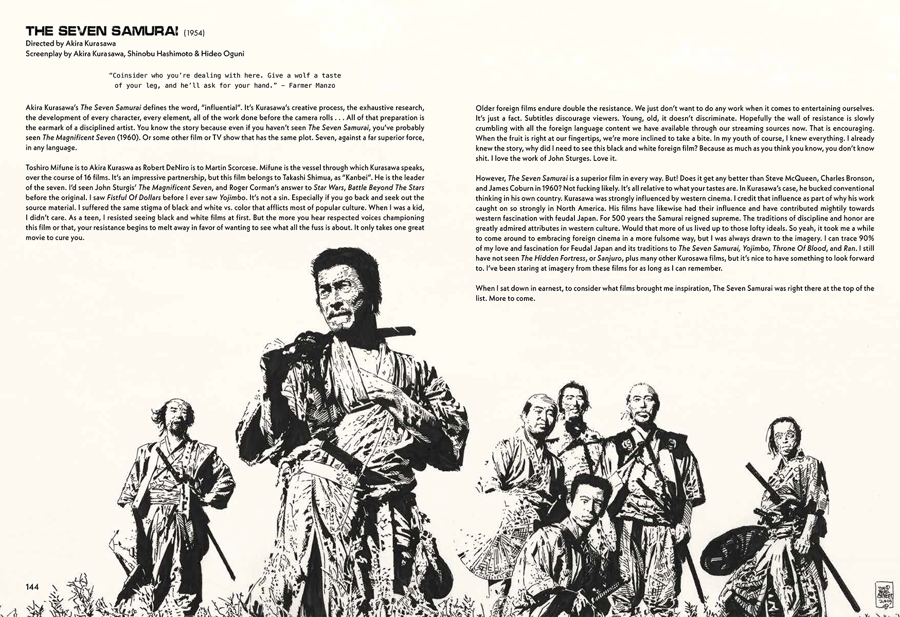
Tim: Yeah, it’s like a great mixed tape where a Black Sabbath track is followed by a great Ray Charles track, and somehow it works! Simon and Garfunkel into Iggy Pop, into The Melvins, into Sam and Dave. We picked the films at random, so we had plenty of variety. Then we presented them alphabetically. So you get – Peter Weller from Screamers (1995), then John Wayne from The Searchers (1956), followed by Toshiro Mifune & co, from The Seven Samurai (1954). Turn the page and it’s Scatman Crothers from The Shining (1980). It’s a bloody smorgasbord, a virtual cornucopia of cinema icons and fantastic films. There was nothing scary to approach because I was working in my wheelhouse. I attacked these illustrations like a rabid dog. The hunger was insatiable, and I kept going back for more, and more. Eventually I got to the point where I was wracking my brain for where to go next. I also had the luxury of playing to my strengths for the most part. I tend to gravitate more to darker, starkly lit shots, but that was not going to be possible in every instance. That did not daunt me though. So long as I picked juicy shots it really didn’t matter if things were steeped in shadow or not. I also love to work wide open. Sometimes I prefer the look of the line art before I’ve inked in the darks. It really depends on the source material. I have a good eye for the kind of imagery that will hold my interest as I’m drawing. I tried very hard to select images that we all haven’t seen 1000 times. In some cases that was unavoidable, but wherever I could, I made it a priority to deviate from familiar imagery. It’s a challenge to find alternate images from films made before the advent of the digital age. Sometimes there’s just not a lot to choose from in terms of reference photos. When I was faced with little dilemmas like that, I went out of my way to get creative in terms of how to take something old and make it look new again.
There were also some images that were quite a challenge, but I let none of that prevent me from taking the shot. If I failed, so what? I had nothing to lose. One image that I wasn’t sure I could pull off to my satisfaction was James Hong, from Blade Runner. There were tricky bits like the foreground elements being slightly out of focus, or trying to pull off the atmosphere of the icy cold environment that he’s working in. There were lots of levels of depth, plus instances of high contrast, like light glowing off of the scientific instruments he’s surrounded by. It was a lot to keep in mind while I was penciling, and I still wasn’t sure how I was going to approach some of it technically. I guess I had nothing to worry about because I just cruised through it on automatic. It was one of those situations where I finished and said to myself, “How did I do that?” The variety of subject matter actually kept things fresh. There were challenges, absolutely, but in retrospect, I didn’t get hung up on them because I set out with the idea that no subject, no scope, no technical hurdle, was going to bar me from making the attempt. I went into the whole thing with a brazen, naked confidence.
Mark: Most of the film entries also feature write ups by you where you speak specifically about the film itself, why this film or that struck a chord with you. Some are quick breakdowns of the specific film, singling out directors, writers, cinematographers, production designers, composers, actors, actresses, etc. – You also share personal anecdotes, like how old you were, what the experience was like, if it was the film itself or specific individuals inspired you, or both! That’s the type of thing we all can connect to. What is the overall concept you want to convey to readers with these words?
Tim: You hit it right there, “the type of thing we all can connect to”. Exactly. This is the ‘celebration of film’ part. I wasn’t exactly sure what I wanted to do with the empty spaces between the art when this whole thing began to solidify. I knew what I didn’t want. I wasn’t interested in discussing the artwork. No titles. No technical details. Not that kind of book. It was always going to be about the movies first. Everyone has a personal story of how a movie has marked them in some way. That’s all I’m really attempting to do here. It’s an excuse to talk about movies. There’s no need to overthink it.
I love to talk about movies, and I love to talk about the people who make them. I’m happy to be your narrator. The art of filmmaking is infinitely fascinating to me. I want to share that. I’m nostalgic. It tickles me to relate an experience. I can easily remember what it was like to discover Monty Python’s Flying Circus on the local PBS channel at 10pm on a Sunday night when I was 13 years old. It changed the way I understood comedy. It introduced me to concepts like satire, sarcasm, and irony. That experience left me altered, very much for the better. I also fondly recall sneaking downstairs and hiding behind the couch to catch just 15 minutes of Halloween, during an HBO free weekend when I was 12. Then, sneaking back upstairs before I was caught in the act, and then spending the next 40 minutes lying in bed attempting to process what I just saw with my naive young eyes. It’s the babysitter, running from house to house in the middle of the night, banging on the neighbor’s doors, screaming for someone, anyone, to help her… and no one is helping her. And my goodness, the music! Tense, rhythmic, nerve wracking, and freaking terrifying. Those personal anecdotes are great for color, and most anybody can identify with things like that. That’s the kind of movie story I love to hear. The content should be familiar but I also hope to turn people on to films they may have skipped over, or perhaps never knew existed. Are you bored with the same old choices as you skip through streaming options? Sometimes all you need is that one little spark and voila! A movie that didn’t appeal to you an hour or a week before, is now somehow relevant and you get excited to see it. That’s a door I hope to kick open right off its hinges. You start talking about a film you love with someone who has not yet seen it, whether the film is 30 years old, 3 years old, or 3 weeks in the theater. The conversation changes the game. Basically I’m just sharing my love of movies, whether it’s the film itself, the poster, the writer, the director, the cast, the artists who bring it to life, I love learning things I wasn’t aware of before I struck up a conversation with friends or even strangers who share this passion. I think that’s it in a nutshell. There are times I do speak a little about the art in the book, or get into why I was inspired to draw a particular actor, or a particular film subject.
Mark: I’m curious about the challenges of the production process, and the formatting of the book itself. How difficult is it to put together once you have all the pieces of the puzzle? Do you see the endgame in your head as you’re doing it, or does it come together organically over time, or just as it has to? Were there times where you had to take pieces out or add pieces in just to make it flow better?
Tim: We figured out a framework for the book early on. We had a pretty good idea of the endgame, but the process of the work, from nascent first ideas to where I ended up was 100% organic growth from front to back, wall to wall. We had to establish a basic format that set the tone for a series of volumes. The look and feel had to be consistent from book to book, so whatever we came up with, we’d be using that as the model for an entire series of books, under the Cinematica masthead. Once we established a basic framework, we tailored our content to work within that boundary. For some of the films, I have more illustrations than we could fit into this book. There’s a good deal of content we had to leave behind, but the beauty is, the exclusion doesn’t hurt because it’ll just go into the next book, or the next. Steve did an initial pass on the layout using the art we curated, but we had none of the extra graphic imagery in our heads yet. He handed the first pass over to me and I did my pass. His first pass was extremely important. It set the tone and gave me something extremely thoughtful to springboard off of. There was a transformation, but a lot of the work from Steve’s first pass is still recognizable, which is a testament to his instincts. He had no ego about it. His unfailing reply was, “It’s your book, Tim.” Those are the words every artist named Tim longs to hear! Truthfully, Steve was a joy to work with. He and Phil made the work fun. To see the whole thing put together.
Mark: For prospective readers and folks who wisely plan to consume this incredible project, are there going to be any other voices people can look for in the way of contributions to the overall presentation? You know a lot of incredible artists, writers and performers who I’m betting could add to the presentation, but what are your plans for that sort of thing? I definitely want to give proper nods to Steve and Phil and others who have already been part of the process, but do you see others, perhaps in future volumes, being part of the process and final product? Perhaps themed books that cover specific genres?
Tim: Yes! I want to bring in other like minds, other artists with a passion for the material. If this series of books proves to be fruitful in any way, I’d love to offer a platform for creators who love this type of theme. I also plan to add voices other than mine to do commentary for the films. I’ll continue to do the lion’s share, but there will be some interesting surprises coming up. What I would term, special guest spots, where certain notable personalities from the music, TV, and film industries would contribute commentary for a specific film. Maybe that person is a film composer, and I pose the question, “Is there a specific film you saw that flipped a switch, and made you want to do this for a living? So let’s imagine the answer is yes, and the film they choose features an orchestral score that was pivotal in their decision to create music for the movies. Then I do 1 or 2 illustrations based on that film choice to accompany their personal thoughts on the subject. That choice becomes 1 of the 75 films we include in that specific volume. I’ve already got some actors and a director or two lined up to contribute to volume 2. The guest spots will not be limited to actors, writers, composers, directors, or crew. I’ve also reached out to several well-known musicians, and other creative artist personalities. That’ll be fun. It completely intrigues me to learn what films resonate with the people I’m influenced by. I think anyone who loves movies would enjoy a little insight like that, straight from the horse’s mouth. Those types of personal anecdotes will totally up the fun factor. There needs to be fan interaction too. Regular folks like you and me. That may be something I can build into the crowd funding next time. Maybe have 3 to 5 slots available in a prize tier. I’m not really sure how all that works, but the point is, I’ll take a block of commentary from anyone who can speak passionately about a movie they love. If I don’t already have artwork waiting in the wings, I’ll create that content specifically for the occasion. Part of that prize will be owning the original art that was published along with their contribution. I think that would be a cool thing to do.
We already know that one of the upcoming Cinematica volumes will be a dedicated “All Television” special edition. I’ve got dozens upon dozens of finished artwork based on TV shows and TV characters – Star Trek,Doctor Who, Dark Shadows, X-Files, Millennium,Fringe, fun stuff from the late 50’s and 60’s from The Rifleman to Lost In Space. There’ll be a fat section dedicated to The Twilight Zone, which is a favorite subject of mine. Time Enough At Last – Burgess Merideth as Henry Bemis. Jack Warden from The Lonely, Vera Miles from Mirror Image, to name just a few. I’ve got a lot of TV subject matter sitting on the bench, and I want to give everyone a chance to play. We’ve loosely discussed a Sci-Fi, and/or Horror special edition, or a Hollywood Tough Guys special edition. I’m all for planning ahead but right now it’s all about rolling out the red carpet for Cinematica Volume 1. Please pre-order during the Kickstarter funding effort!
You can pre-order CINEMATICA right now using this link